Eyebrow Text Here
5 design principles every brand should follow

By James Watson
Posted on
25.02.2025
Some brands seem to stand out without trying. It isn't luck. It's design doing its job.
A strong identity makes people recognize you on sight, trust you faster, and remember you in a crowded market. Five principles do most of that heavy lifting — whether you're a startup or an established name.
1. Consistency: the foundation of recognition
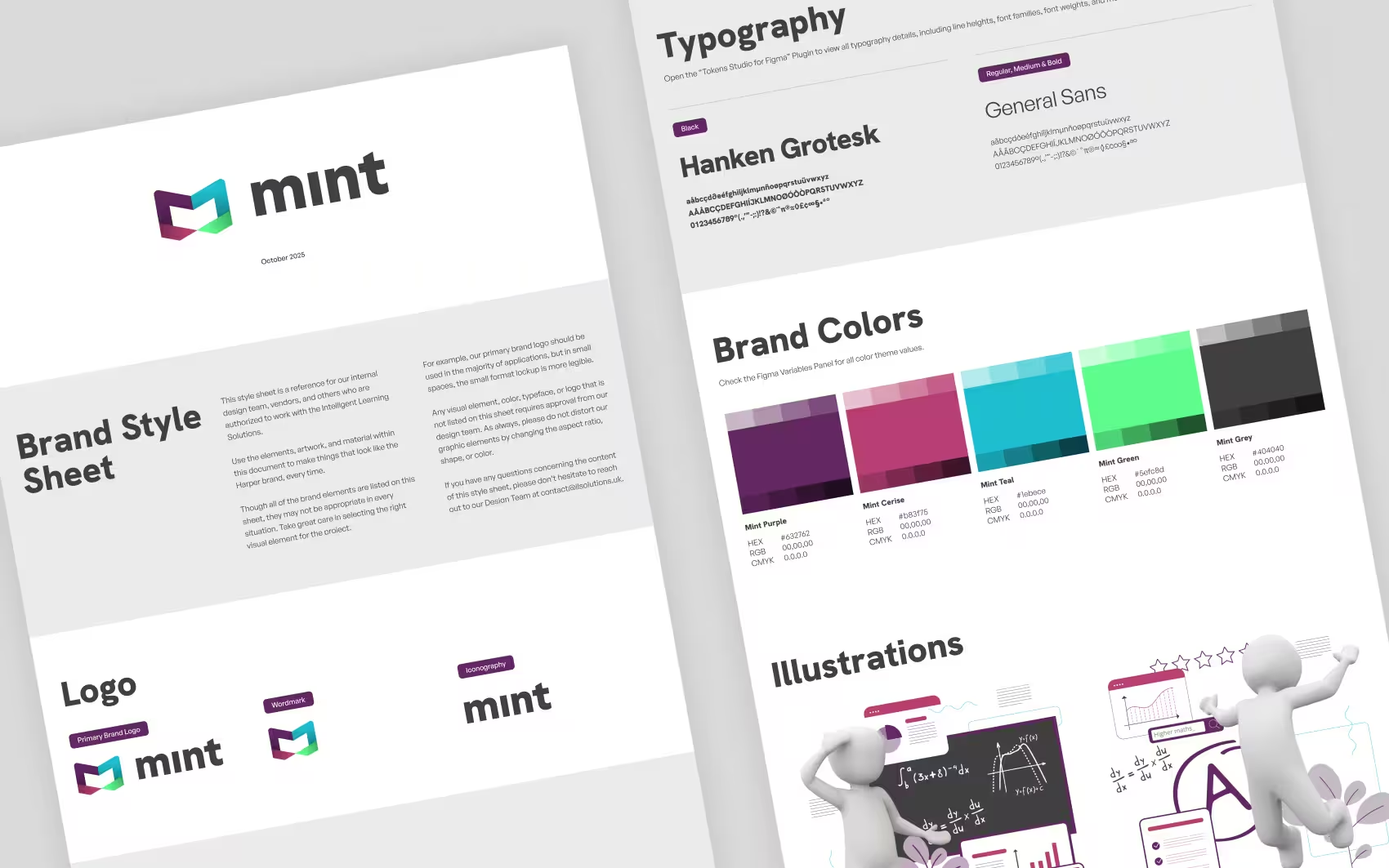
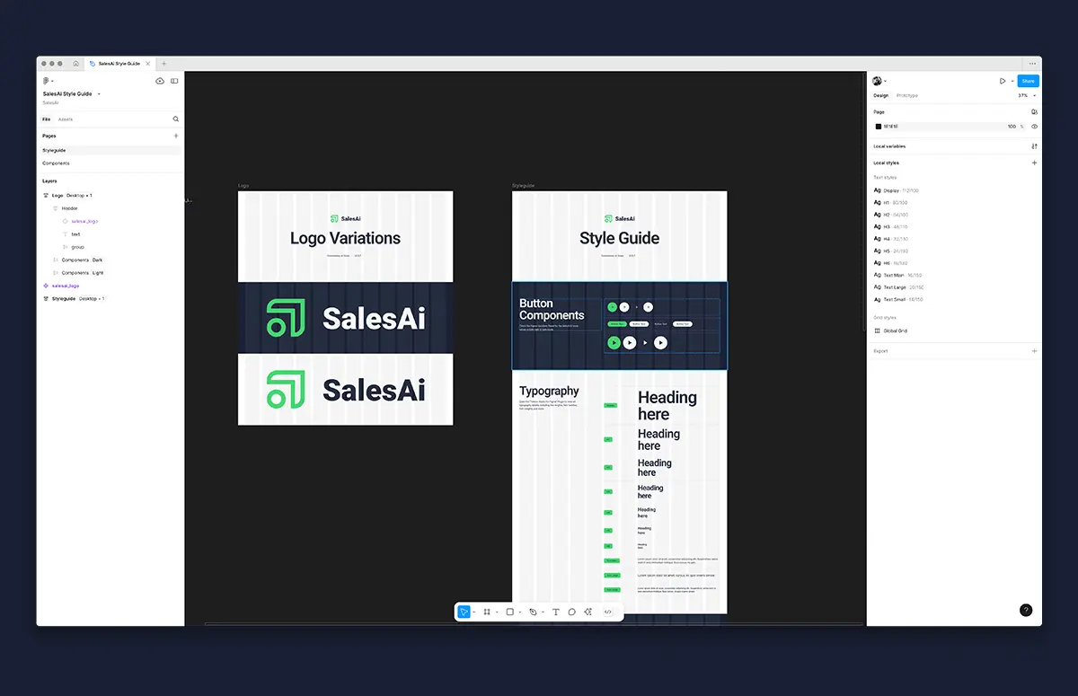
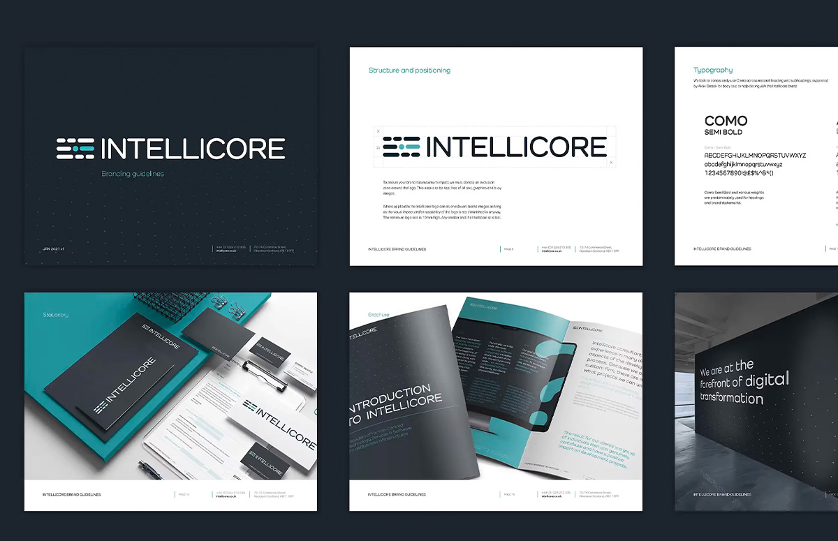
Treat your brand like a person. If it looks different every time someone meets it, they never learn to recognize it. Use the same colors, type, logo, and imagery everywhere — site, social, print, storefront. Repetition breeds familiarity, and familiarity is what makes people pick you without thinking. Build a brand style guide, keep the palette tight, choose a few deliberate fonts, and skip the generic stock photos.
2. Simplicity: the power of less
In a world drowning in information, simple cuts through. Clear designs are easier to understand and far easier to remember. Give elements room to breathe, make every element earn its place, and write like a human — no jargon, no filler.
3. Hierarchy: guide the eye
Good design tells people where to look first. Size, weight, and contrast create a path through the page so the important thing lands before anything else. Without hierarchy, everything shouts and nobody hears you.
4. Distinctiveness: earn your difference
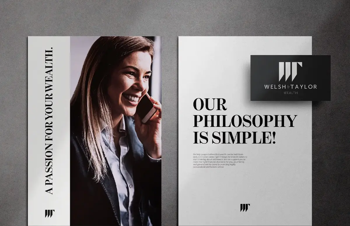
Being different only pays when the difference means something to your audience. Define what you actually stand for and let the identity carry it. We gave Welsh & Taylor a modern, award-winning monogram that broke every stuffy convention in wealth management, and built the "casual formal" identity that sold out One Golden Square's opening week. Distinctive, and relevant — not different for the sake of it.
5. Adaptability: design for every screen
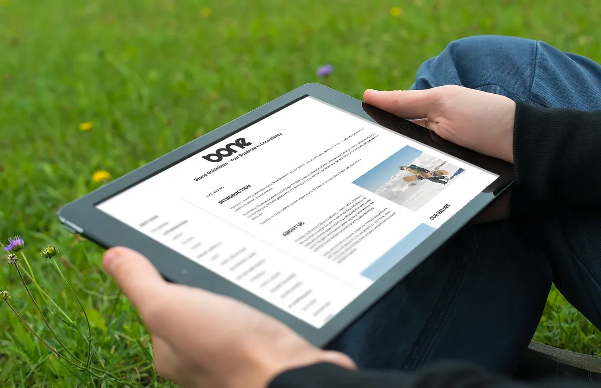
People meet your brand on phones, tablets, and laptops, often in the same day. It has to hold up on all of them. That means responsive design, images optimized so mobile doesn't crawl, and layouts that flex without breaking. We build in Webflow precisely so a brand stays sharp and loads fast on every device — the way we migrated McLean Financial Services off a clunky legacy site and lifted their traffic 300%.
Consistency, simplicity, hierarchy, distinctiveness, adaptability. Get these right and you're not just making a brand — you're building an asset that pulls in customers and keeps them. If you want a team to bring them to life, that's our brand identity and strategy work.
Turn your logo into a real brand
Consistency, clarity, and design built to convert — brought to life by senior specialists, not juniors.
relevant insights

What we actually do