Eyebrow Text Here
What makes a good B2B website design?
By James Watson
Posted on
18.11.2025
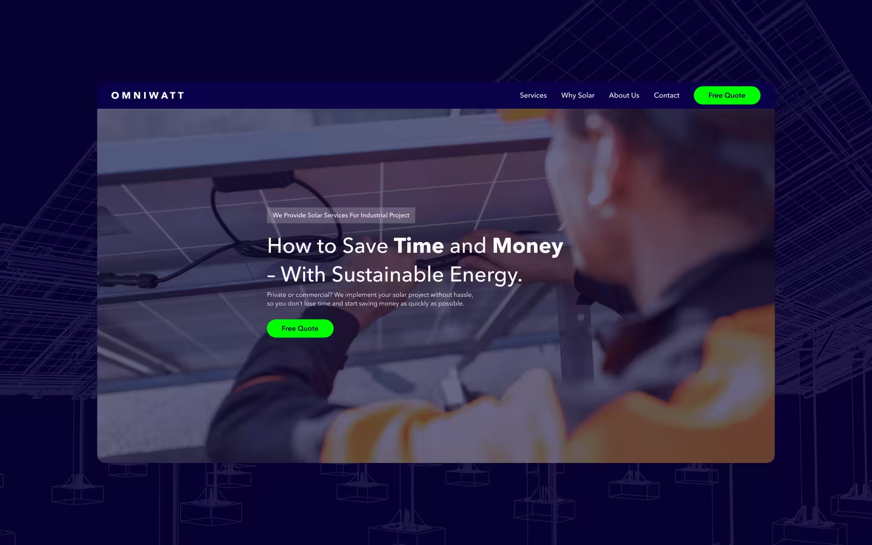
A good B2B website is a growth engine, not a brochure — and if yours is a brochure, it's quietly costing you pipeline. It loads fast, states its value in seconds, and guides a technical buyer through a logical journey they can follow without a manual. Clarity beats cleverness every time, because your buyer is comparing you to three competitors with the tabs already open.
What separates a growth engine from a brochure
- Fast load speeds. B2B buyers won't wait, and Google won't rank a slow site.
- A clear value proposition. What you do and who it's for, visible in the first screen — before they bounce.
- A logical structure. Cut the clutter and map a path from first screen to enquiry.
- Understandable interfaces. Even a complex, technical product should make sense without a manual.
Making complex products clear
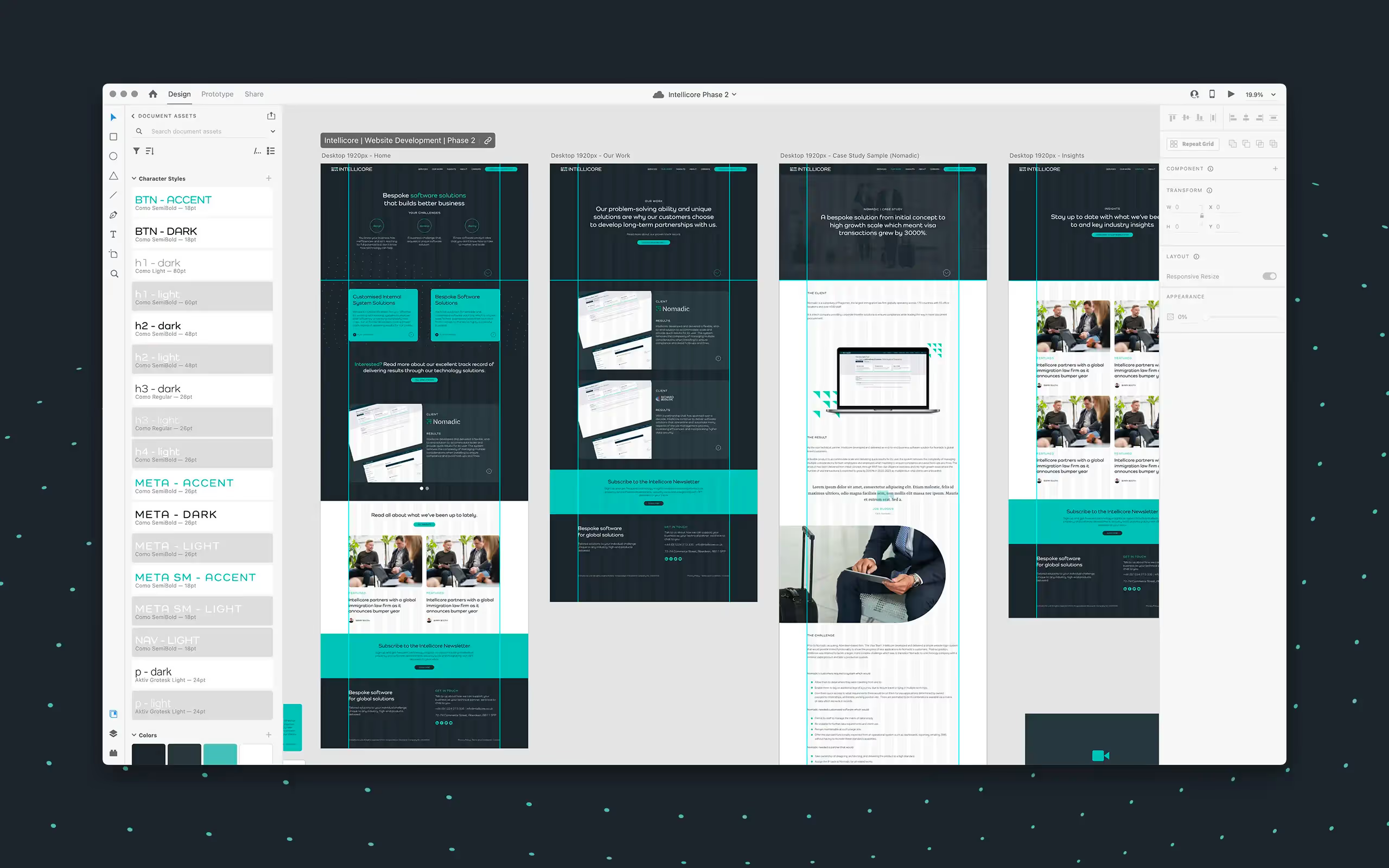
The hard part of B2B is taking something genuinely technical and making it obvious to a buyer who then has to sell it internally. We did exactly that for NorOilTools in the oilfield sector and Intellicore in complex B2B software — cutting the clutter, smoothing the journey, and letting the value land fast. Not decoration. Conversion.
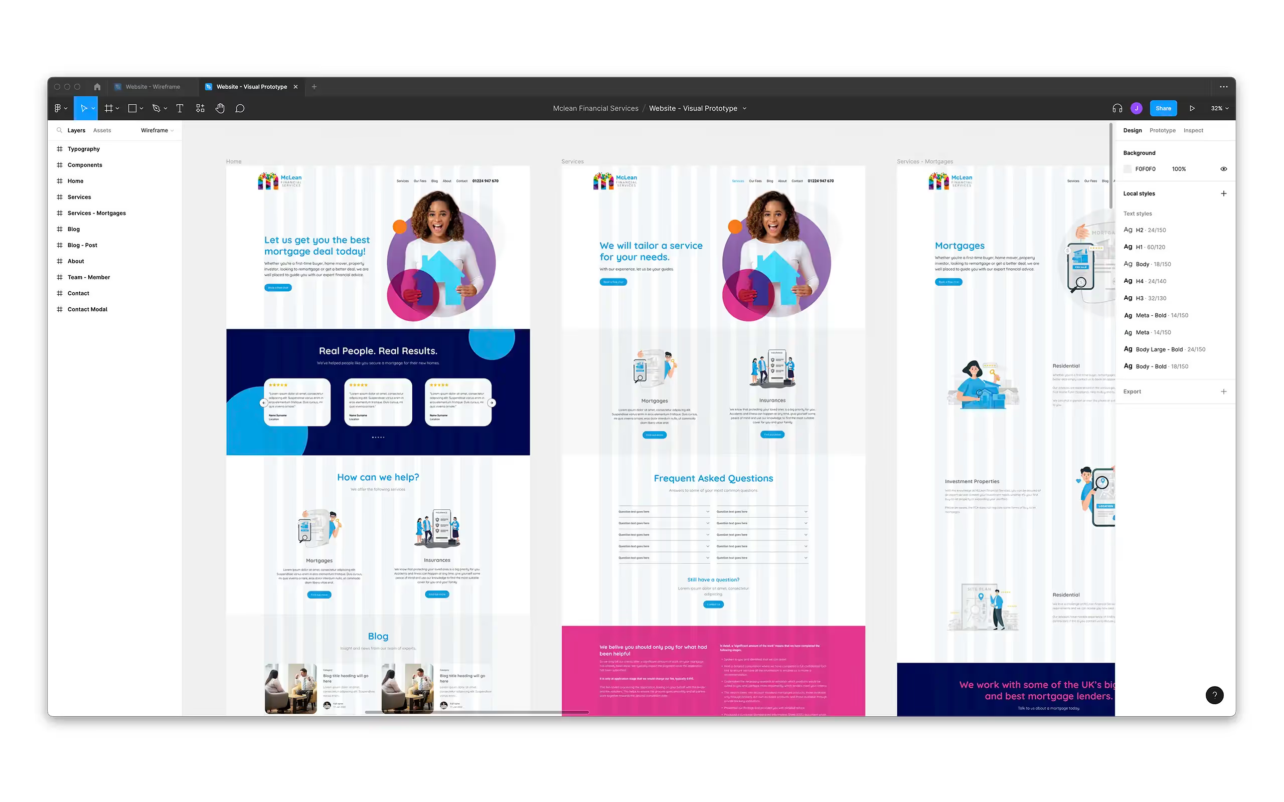
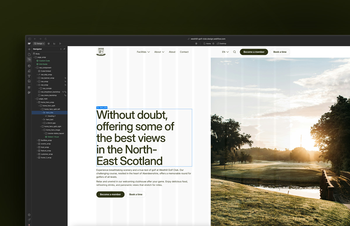
If your site looks fine but isn't generating enquiries, that's usually a structure-and-clarity problem, not a visual one — and it's the overlap of our UX/UI product design and Webflow work.
Turn your site into a growth engine
Clear, fast, and built to convert technical buyers. Let's talk.
relevant insights




What we actually do